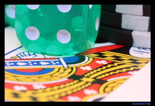
some of my latest work
By crosschk
@crosschk (818)
United States
3 responses
@javmagik029 (187)
• United States
24 Jan 08
obviously it reminds me of gambling and a casino, but one thing i might try for next time is to have the cards a little bit clearer. it looks really good this way and maybe this is the look you were going for but personally id try to have everything clear and in focus. very nice photo.
@miaphoto (19)
• United States
4 Feb 08
Pretty cool photo. I like the abstractness of it and the colors are neat. Your focus looks fine to me, obviously you were going for a really shallow DOF. The only thing I'm not crazy about is the white thing in the corner. Kinda messes up your composition.


