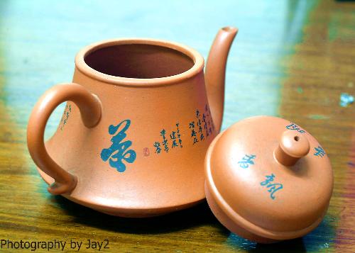
Need your inputs for improvement with my photo
By jay185
@jay185 (17)
2 responses
@jayperiod (870)
• United States
3 Feb 07
Posing and cropping of the photo are fine. It's well positioned. The problem seems to be your lighting. I would put it on something non-reflective. That green area behind and around the teapot is very distracting. Putting it on a solid colored background that doesn't reflect what' around it would help. Cloth is fine, but the grain of it will show. Paper would be better. Be careful of white, though, because unless you have a lot of light, you'll get gray instead of white. Talking about lighting, you need to move the light source up higher, if possible. That would light the inside of the teapot and give it more detail.
It seems like you have the knack of it, just keep working with it. It's trial and error, and there are generally more errors than trials!
1 person likes this


