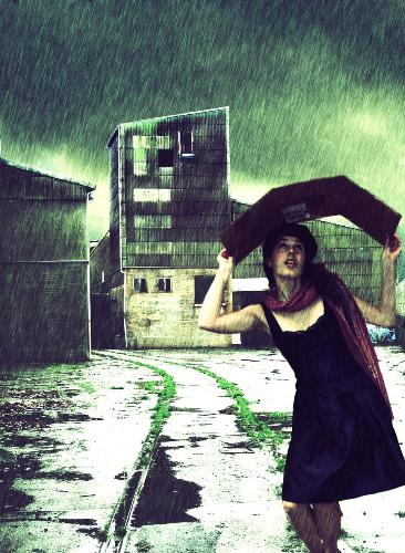
Please rate this Manipulated-picture!...
By don_sheru
@don_sheru (160)
India
May 18, 2007 5:37am CST
I have manipulated the pic using photoshop. The background i staken by 'mycamerandi' and model by 'Jacques'. Please comment any critiques if found any...
4 responses
@don_sheru (160)
• India
18 May 07
lol...it is a women! dont know why MyLot is displaying the pic too small! well it was not actually raining, i did it!you can check my site for full view and see the original pics too! - http:/donsheru.deviantart.com/
btw, thanks for comments!
@sojournseeker (1244)
• United States
19 May 07
I think this form of creative expression took some time and skill in creating a magnificent 3-D effect with the toning, subtle hues and the rain nearly plummeting down from the sky as the timid woman only fears getting soaked . . . Excellent !
This site below will pay you for 'beauties' such as these . . .
http://www.shareapic.net/gallery.php?user=29662
sharing the light,
Erica the Enlightenment Advisor,M.A. TranspersonalPsych
http://www.enlightenment-psych.net
@wolves69 (755)
• United States
19 May 07
I don't get hung up about the technicalities of the "shot". If the picture tells a story and can bring out emotion or draws a response, then the artist did it right.
I would ask what would a young lady be doing by an old dilapidated coal breaker, in the rain with what looks like a sun tanner? To top it off, why is she wearing that type of dress? What was she expecting to do at that location in that she isn't wearing what you would expect her to wear?
To me, this would look like a cd cover for a popular song that the title can answer some of these questions.
Still interesting though...
@celestemichelle (429)
• United States
18 May 07
I don't think the model looks like a man at all. I like the colors, texture, and overall feel of the scene. but it looks like a a model dropped into a background, which I assume isn't the look you were going for. Some of her edges are a bit too sharp, but I think what hurts the image the most is composition.
The background creates a focal point between the two buildings and the model is competing with that. She almost wins because you placed her so far up front, but she's leaning into the background's focal point, and the lines of the track are so strong, with the vividness of the green grass to help. Intensifying the red scarf might help.


