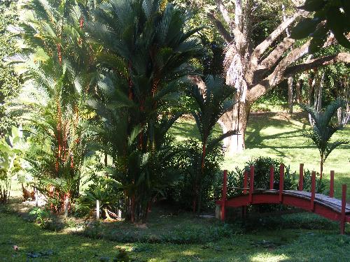
Photos rejected by Shutterstock
By beli44
@beli44 (51)
Puerto Rico
11 responses
@Pigglies (9329)
• United States
14 Feb 08
I think ShutterStock rejects a lot of photos that would sell on other sites. I've tried to get into ShutterStock a few times. I finally decided it isn't worth it, I don't even like the layout of their site anyway. I'll stick with other sites where I'm making money selling photos they thought wouldn't be popular.
1 person likes this
@HollywoodBarbi (618)
• United States
14 Feb 08
what other sites do you belong to?
i've been thinking about selling my photos, but not sure where to go.
@Pigglies (9329)
• United States
15 Feb 08
I've had the most success with BigStockPhoto. I've sold a lot of photos on there.
Here's my referral link if you're interested (you don't have to use it, but I'd appreciate it):
http://www.bigstockphoto.com/?refid=gyD1FGl9wP
It's been a steady trickle of extra spending money for me. And I never really take photos that are just for them, I'll just submit photos that I took anyway that I think would probably sell. I've had some photos rejected on there as well, but over 90% of my photos have been approved.
@Emma30587 (402)
•
8 Jul 08
I didnt know you could sell your photos online! are the websites good?? what do you do? where do you start?!!!!

@jayperiod (870)
• United States
14 Apr 08
I'll try to help. It seems that the highlight areas are "blown out." That means they are too bright, such that they lose all detail. The subject area, the bridge and tree in the center, are a little too dark in contrast to the edges. You really would have needed a flash of some sort to bring out the bridge and allow you to use less exposure on the background. Also, the bridge seems to lead off the photo. It may not need to be centered, but more toward center, so that there is somewhere for it to land and lead.
Hope that helps.
1 person likes this
@MrCoolantSpray (1005)
• United States
23 Feb 08
It's got pretty high contrast. Compare it with photos you see on greeting cards and in magazines, and you'll see a difference. Stock photo sites demand the highest quality.
1 person likes this
@thebeing (657)
• Romania
14 Apr 08
this photo is not properly exposed. There are too much overexposed areas, and a big underexposed area. I think that's the reason they rejected it.
+ is this a stock photo? are you sure? could you name one ... "industry" that would use this photo?
1 person likes this
@uiwwitch (892)
• United States
20 Feb 08
I hope that you would appreciate our comments. I would like to be able to help.
I don't see any real focus in the photo. If you can go back, try to focus more on the bridge which I think is interesting. Also, try to take photos at the right time of the day. I can see that the sun is bright and it adds to the distraction.
I hope that you can post your "revised" photo here considering all the suggestions posted by other mylotters. We'd love to see how it came out.
1 person likes this
@trickiwoo (2702)
• United States
18 Feb 08
It's a nice photo, but it is not very usable for stock. The front is very dark, and the background is very light. Stock photos should be evenly lit throughout the entire photo. There shouldn't be any dark shadows or really bright spots. Stock photography has very specific requirements, so they are going to reject photos that meet those requirements. So while this is a nice photograph and can be used for many other purposes, it does not make a good stock photo.
@craftwave (1338)
• United States
16 Feb 08
while I think the subject is interesting the lighting is not good. You have lost a lot of detail in the bright areas and also in the shadows.
1 person likes this
@uiwwitch (892)
• United States
20 Feb 08
I hope that you would appreciate our comments. I would like to be able to help.
I don't see any real focus in the photo. There's the palm tree, the bridge, other trees in the background, shadows. If you can go back, try to focus more on the bridge which I think is interesting. Also, try to take photos at the right time of the day. I can see that the sun is bright and it adds to the distraction.
I hope that you can post your "revised" photo here considering all the suggestions posted by other mylotters. We'd love to see how it came out.


@Betty34 (267)
• United States
15 Feb 08
I think that is a pretty picture, the only thing I see are the shadows of the tree in the lawn. Maybe that is what they were talking about.
The colors are beautiful. And it looks serene.
I have a major problem with shadows too. And sometimes they work in a pic.
Only my opinion, don't mean any disrespect.
B
@ethansmommy06 (401)
• United States
24 Mar 09
i have had the same problem with them. i use bigstock photo i havent made any thing yet but i havent had but one accepted the other ones were denied because there were enough of the subject. try them out. try fotolia too. i think your photo is really nice.


